A Redesign MVP
on a Tight Deadline
Role: Content Designer
Tools: invision, Figma, The Hemingway App, Oxford Learner’s Dictionaries
Overview
Remote Deposit is a feature in PNC Online Banking that allows business users to deposit checks digitally with a desktop scanner.
As part of PNC’s Online Banking redesign, the product team needed to align Remote Deposit’s UI with the new Online Banking designs while ensuring that Remote Deposit was accessible and easy to use.
My role involved research, collaborating with the product team and accessibility, legal, risk and compliance partners to contribute clear and accessible content designs.
The Problem
When I joined the team, PNC was using a platform designed in the 90s that provided a poor and inaccessible experience. PNC even faced a class-action lawsuit over its inaccessible public website and authenticated Online Banking platform. In addition to fixing accessibility issues, executives wanted an improved digital experience that increased task completion rates and reduced calls to the customer care center.
To meet the aggressive deadline, stakeholders asked product teams to make minimal design changes to the redesign MVP. They particularly wanted to reuse most of the existing content. However, Remote Deposit contained confusing terminology and poorly structured content that resulted in it being inaccessible and driving abandonment rates and calls to the customer care center.

Over Cluttered Introduction Page
The original page was designed with some benefit statements above. The detailed paragraphs about the application process and pricing caused cognitive overload and made it difficult for users to scan the benefits, pricing and most important information needed to apply.

Application Step 1 - Account Selection
In the original application, account selection was sandwiched between 3 lines of body text above and several lines of body content below.
The user is also asked which “non Linked account” to enroll without having seen the term “non Linked account” elsewhere in Online Banking.
Users
Users:
Small business owners
Small business managers (referred to as “controlling parties” by PNC and other banks)
Business employees with relevant financial roles (referred to as “delegates” by PNC)
Process
Simplified the experience using best practices and creativity
UX was new to PNC and stakeholders were often hesitant to test our new designs. With the exception of the testing the team did on the NAICS code field (I discuss this in When We Designed for Tech Constraints Instead of Users), the product team wasn’t willing to budget time and other resources for user testing. So
I worked with designers and product managers in workshops and design reviews to refine voice, tone, and clarity across the experience. I targeted a 6th–8th grade reading level to support quick, on-the-go comprehension.
The team observed that “non linked accounts” caused confusion in the application. To solve this, the UX designer and I decided to first ask users which accounts they wanted to enroll, only showing users eligible business accounts associated with the user ID they’re enrolling with.
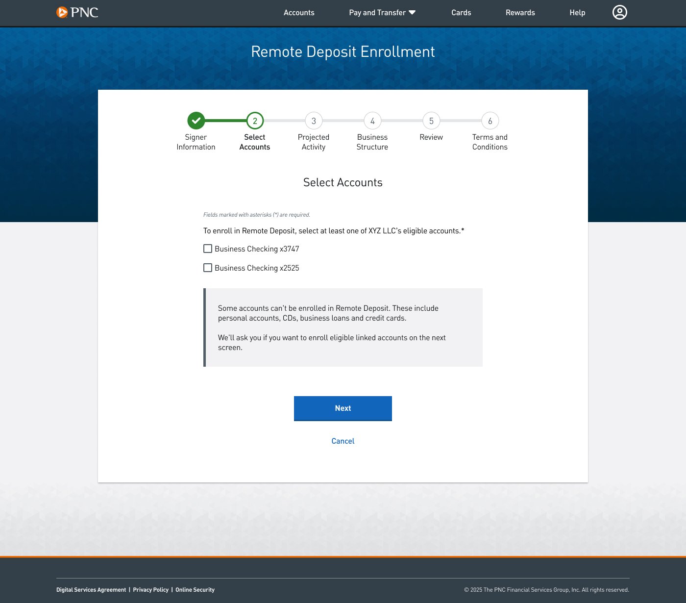
Select Main Accounts
To simplify the terminology for account types, I worked with the UX designer to break the account selection process into multiple steps. This allowed me to remove “non linked account” from the first question.
Next we decided to inform users that we found linked accounts, such as other business or personal checking accounts, and ask whether they wanted to enroll any. If they answered Yes, then they would be asked to select which of those accounts to enroll.
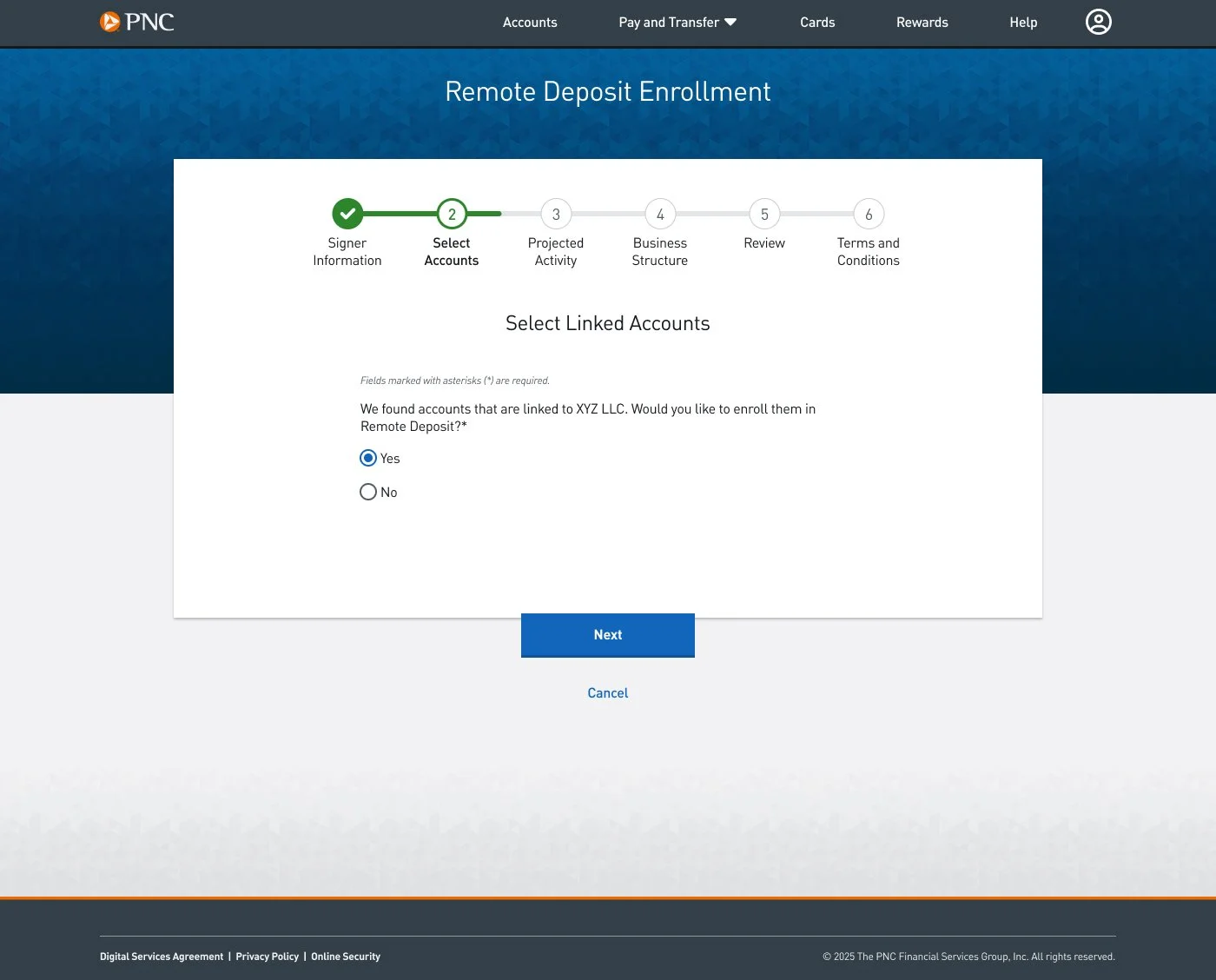
Telling Users They Have Linked Accounts
Next we told users that we found eligible linked accounts and asked if they would like to enroll them. (“Linked accounts” were an account type users were familiar with.)
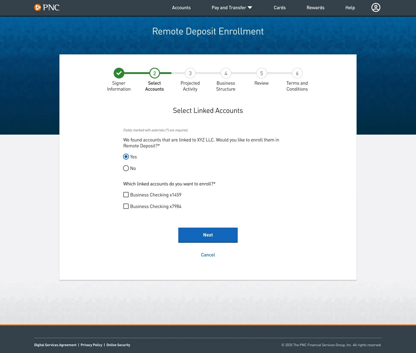
Letting Users Select Linked Accounts
Users who answer Yes to wanting to enroll linked accounts are presented with eligible linked accounts to select.
Designed for accessibility
I evaluated every line of copy with accessibility and cognitive load in mind. I used the Oxford Learner’s Dictionary to replace complex terms with elementary to intermediate (A1–B2) vocabulary whenever possible.
I also reorganized dense sections of content and structured it with headers and bullets to help screen reader users and to increase scannability for all users.
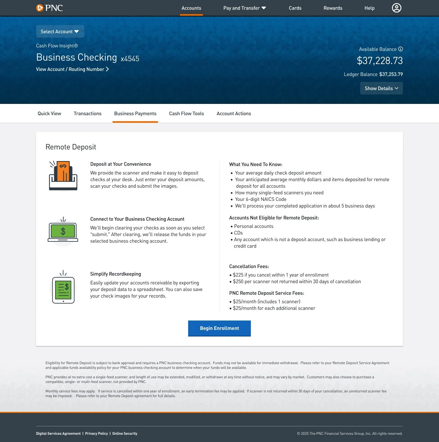
Landing Page Redesign
I restructured the landing page with more headers, bullers and shorter paragraphs to make it easier to scan and use a screen reader, while still providing the user with the all information they needed to convert.
Clarified required technical language
For unavoidable banking or financial terms, I partnered with the UX designer to add helper text and tooltips so merchants could understand concepts without friction.
Tested and tightened readability
I used Hemingway, an online readability tool, to ensure the content aligned with plain language standards and could be scanned quickly.
Maintained alignment with PNC content standards
I cross-checked all copy against PNC’s digital content guidelines and collaborated with other content designers to ensure consistency across product lines.
Outcomes and Next Steps
Remote Deposit passed accessibility, legal and compliance reviews. Designs were delivered on time and ready for launch alongside other small business experiences redesigned for PNC’s new Online Banking.
Next steps include expanding our technical capabilities to autofill as many fields as possible for users to simplify the enrollment process. You can review When We Designed for Tech Constraints Instead of Users for more information.
The product team continues to consider additional user and stakeholder feedback for future iterations.